Starlings Community Project
Starlings Community provides services and supports for youth impacted by parental addiction. Looking for some fresh graphics to use in their materials, they reached out to see what was viable within their tight timeline.
Writing the creative brief with the Starlings Community team was a great experience - providing clear expectations and the opportunity to provide alternative ideas. To maximize the usability of the final images, we decided vector images would be best - allowing for website and print use in addition to infinite scalability without quality loss.
Project pain points were: the tight timeline, busy nature of the Starlings Community & the audience age ranges.
Solutions were: early provision of a well-defined timeline with wiggle room built around client response times and final deliverable date & designs focused on meeting young adults as equal and competent media consumers, rather than reliance on cute or cartoony characterization.
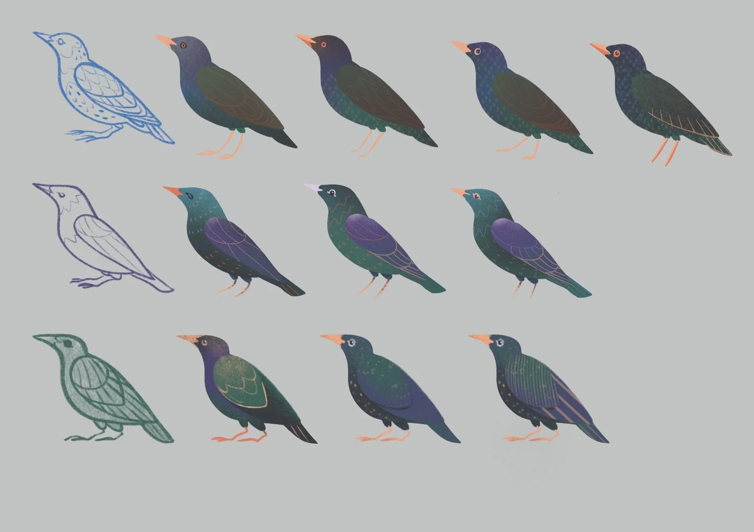
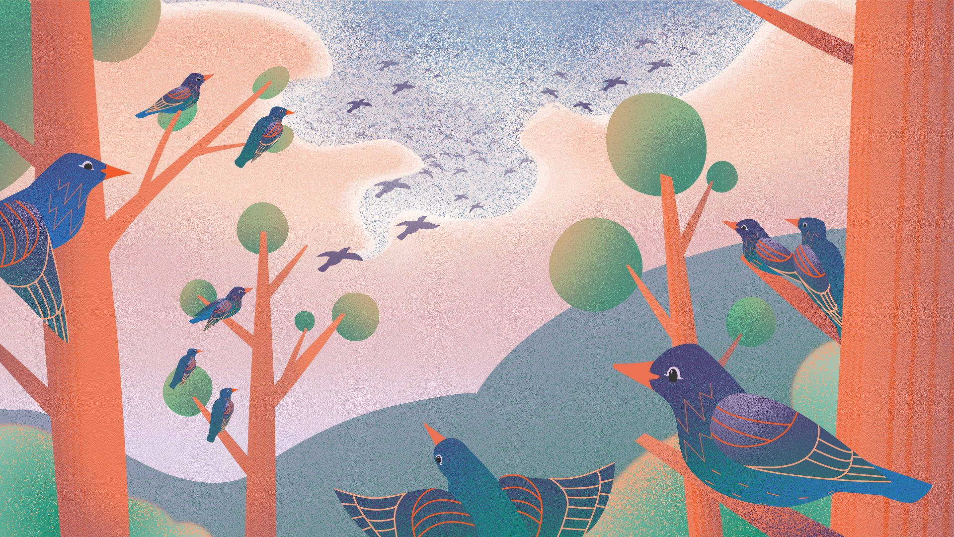
Above: Starling Designs. Keywords - active, engaging & intelligent. Direction from the Sparrows Community team was that they preferred rounder, organic shapes and avoiding cartoon-like eyes.
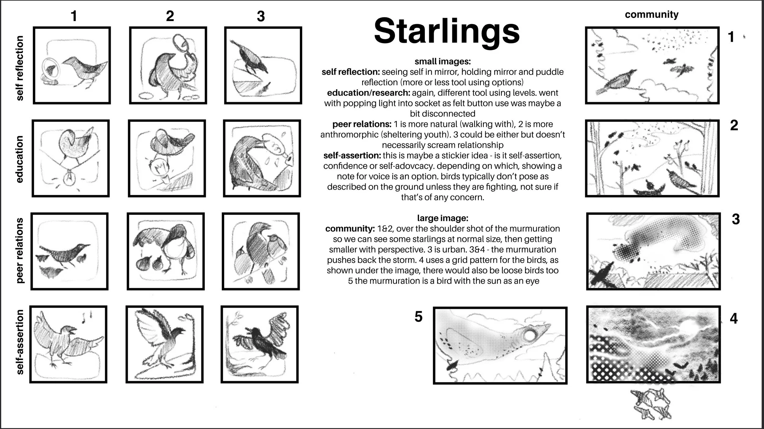
Left: The first round of sketches reflect the values chosen to highlight and the search for appropriate characterization.
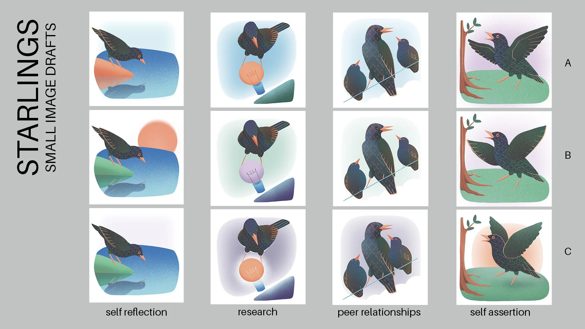
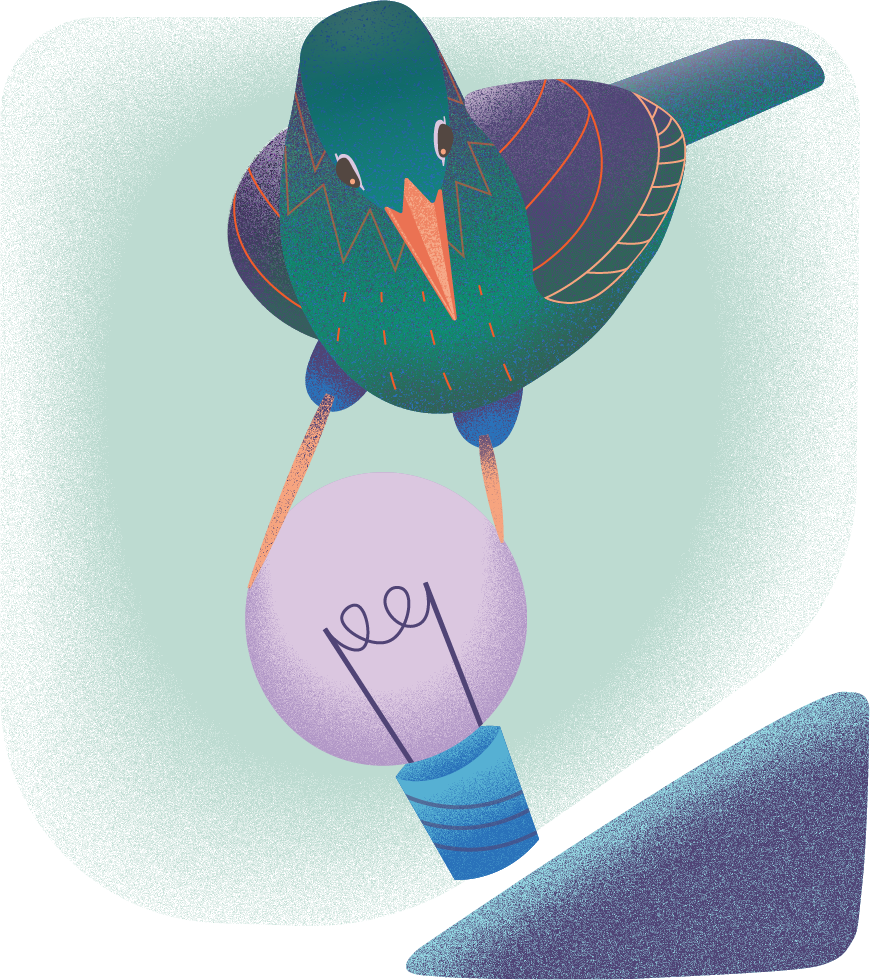
Below Left: The core values of Sparrow Community became four inset illustrations. After a round of sketches, these drafts were created while the Sparrow team reviewed bird designs.
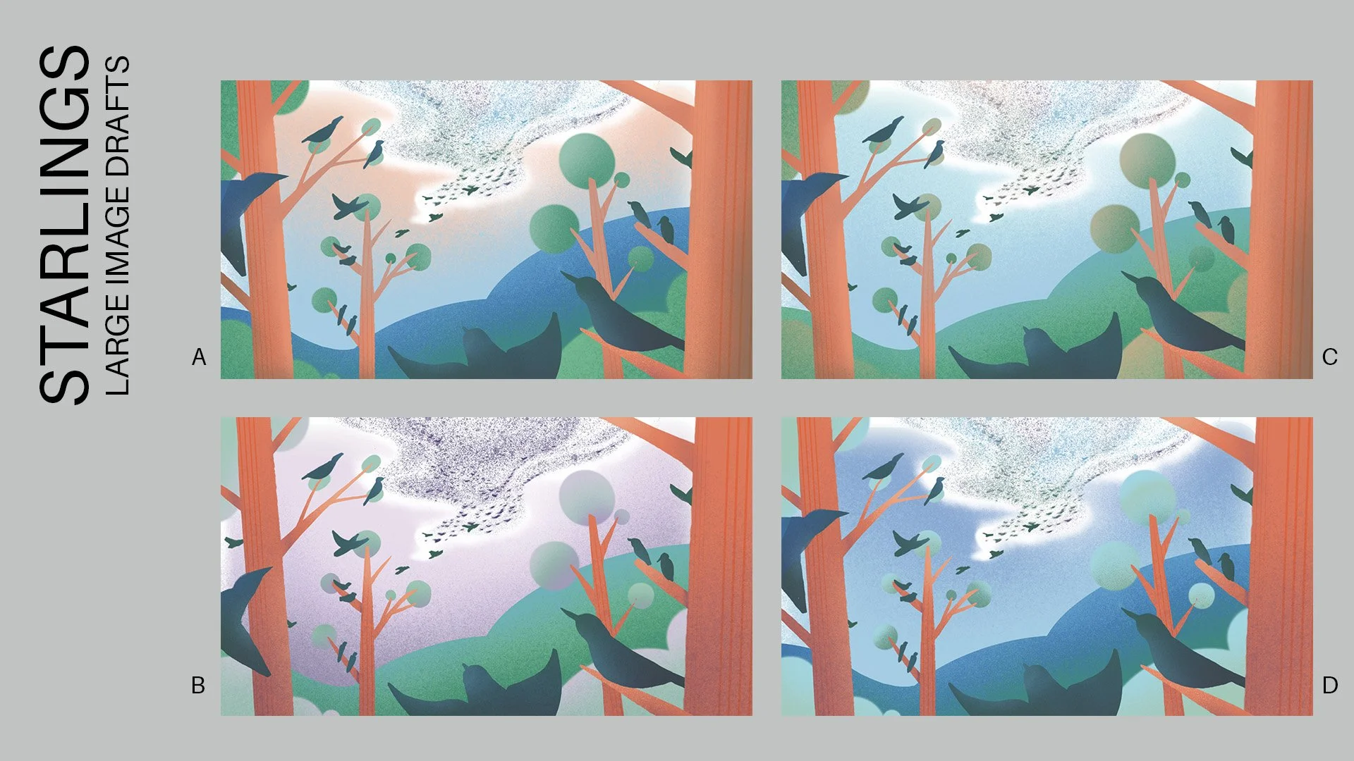
Below Right: Community was the highlight for this project thus one large image highlighting the murmurations starlings are so wellknown for.
